
There used to be a semi-medicinal tonic drink in Thailand which tired labourers used to keep handy for when they needed a pick-me-up. The drink came in a small brown glass bottle you could mistake for containing cod liver oil and was called Shark.
Back then Shark had virtually no branding, no real identity and hardly any sales growth. After seeing similar products re-invent themselves outside Asia and achieve huge commercial success, brand owner Osotspa realised with strategic planning and a strong brand identity, they too could compete in a global market.
Osotspa had correctly identified the reason for drinking Shark was for energy and stimulation.
Stimulating demand
The demand for the drink was discovered to be insatiable amongst the pleasure seeking, music loving and dance-the-whole-night-long youth market. This group may speak many different languages but Shark wanted a form of self-expression to cut through linguistic conventions, becoming instantly recognisable across different continents.
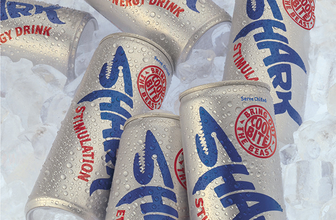
The way young people consumed the drink needed researching, as this was not a group who would stock up weekly on supplies at the local supermarket. Shark could be picked up in a bar or club anywhere from Lisbon to Shanghai, consumed directly from the bottle in some parts of the world, while in other places cans would be required for vending machines in public places such as railway stations, for spur of the moment purchases.
Creating a killer brand
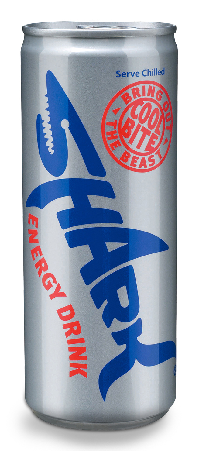
What is it about the shark that makes it the perfect embodiment of the brand? We believe it is potent, commands respect and is adventurous and unafraid of risk. The shark moves with sinewy determination and, most important of all, has a shape that is instantly recognisable. Our design embodies all these qualities, communicating them to the consumer.
By using letterforms to create the Shark motif, the design could be adapted for different alphabets, including Chinese, Arabic and Cyrillic, as well as Latin script. The brand was able to capitalise on the market that had already been created for energy drinks, harnessing colours associated with energy and refreshment, while echoing shark-like hues of the sea.
Ferocious growth
Shark is now the second biggest energy drink brand in the world. Wherever there are young adults out clubbing, there’s Shark. In bars, vending machines and on the beach, the drink has increased sales five-fold. Its success is phenomenal.
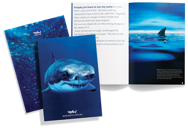
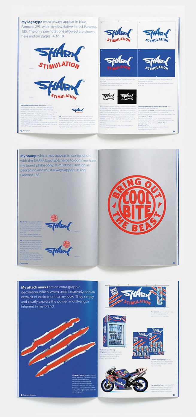
Having established a presence in over 40 countries including China and the USA, the astonishing success of its distribution highlighted a need for consistency in global presentation. To counter potential fragmentation of the brand identity, we produced design guidelines which were circulated to all distributors, resulting in consistent on-brand communications. Our work for Shark went on to win Gold for Creative Excellence in the Beverage Packaging Global Design Awards.
Testimonial
“When we first saw the proposals which Minale Tattersfield presented us, we recognised we had the potential to create a global brand. The results of their expertise in nurturing our growth have exceeded all our expectations.”
Khun Surat Osathanugrah Chairman Osotspa Co. Ltd.