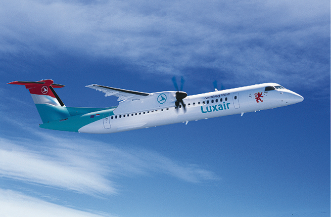
Ready for take off
Luxair is Luxemburg’s national airline company. After years of budget cuts, the airline had begun to lose touch with its identity and values. This situation was having a negative effect on staff and customers, with perceptions of Luxair falling below average in terms of quality versus price. The airline was seen as old-fashioned and entrenched in outmoded values.
Furthermore, the business units making up the Luxair Group each had their own design style, hindering the presentation of a coherent, unified image for airline operations.
An updated brand identity Minale Design Strategy proposed to reflect a specialist service offer and new approach, intended to create staff allegiance and a sense of pride in working for Luxair, as well as satisfied customers. We called the change a quiet revolution.
Solution
As a small airline, Luxair is admirably positioned to make personal service a strong source of distinctiveness by assuring passengers they will be well treated throughout their journey. From a branding perspective, Luxair was seeking to improve its image, including how the airline was perceived, by developing a consistent set of values and a sharper, classier identity.
The five strategic strands of the airline’s commercial strategy in effect became the design manifesto for the updated brand, namely – fix the basics, modernise, strengthen communications, manage the process and engage members of staff.
Once the brand strategy and architecture had been defined we created a new visual hierarchy presenting the previous group of companies within a coherent, more easily understood structure. Using values associated with passion, responsibility and caring, Luxair was able to enlist the support of employees in a more focused approach to quality of passenger service.


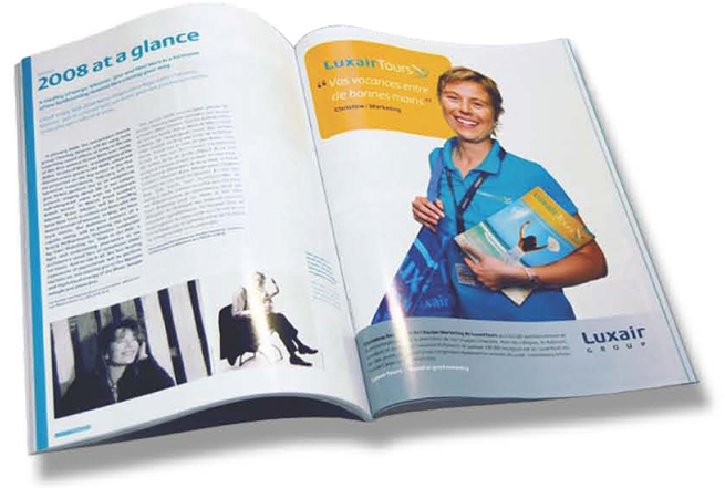
Proud to fly
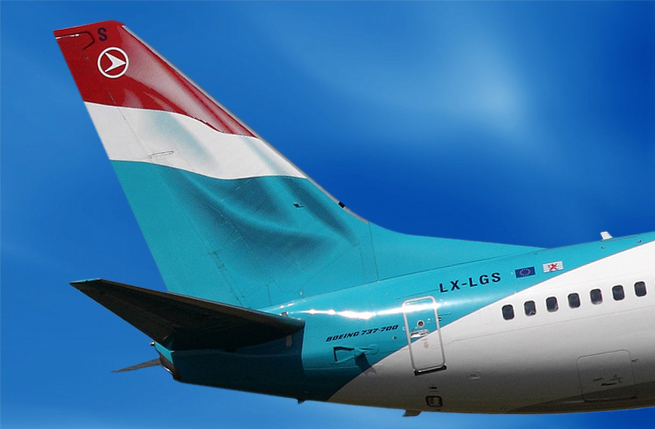
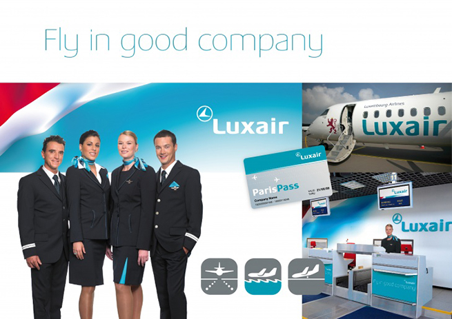
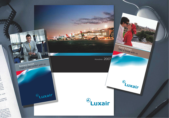
Emphasing the needs of the business traveller, Luxair’s brand identity started to take on a more upmarket look, from tail fins to passenger facilities and services. Luxair Tours adopted the livery of modern welcoming tour operator, while Luxair Services and Luxair Cargo now have a more functional appearance.
The positioning of the Luxair Group became more obviously corporate, appropriate for the needs of its institutional and commercial audiences. The resulting brand architecture, visual hierarchy and shared graphic elements across the group and its subsidiaries have helped create a higher profile, making the airline and its operations easier to understand.
Management Team
Project and Creative Director: Jim Waters
Client Director: Gwenael Hanquet
Design team: Minale Design Strategy - Paris and Brussels offices