
Re-thinking the signage for a public transport system of a European capital city is a major task. Station or stop signs, directional signage, route maps, information panels, coding for different modes of transport all have to come together to form a cohesive, seamless, clutter-free system that is easy for people to follow.
Our group has worked with Transport for London and also Sydney’s public transport system, sharing its expertise and know-how to provide consultancy advice and to deliver design excellence across this type of busy urban environment.
A new direction
When STIB, the organisation responsible for Brussels subway, tramways and buses decided to renew its vehicles fleet, a second project was just about to begin: they wanted to evolve from a public transport operator to a service-orientated company. Asserting this change of status would provide the opportunity for STIB to diversify their activities, but it would require careful adjustment of the brand architecture and control of visual identity elements across all touch points and medias.
To best serve the image improvement programme, it would be important for Minale Design Strategy's team to bear the big picture in mind, how STIB’s offer is reflected globally, as well as for it to concentrate on the small detail that would enable STIB to deliver effectively communicated, differentiated services.
Simplifying sign information
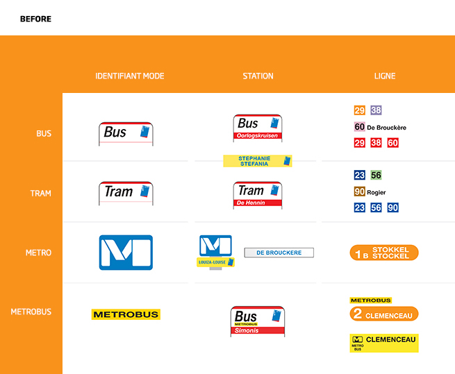
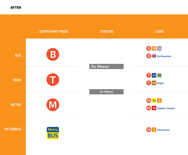
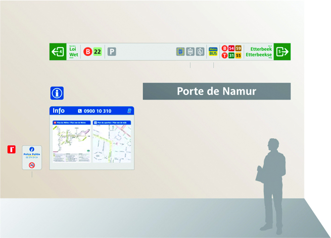
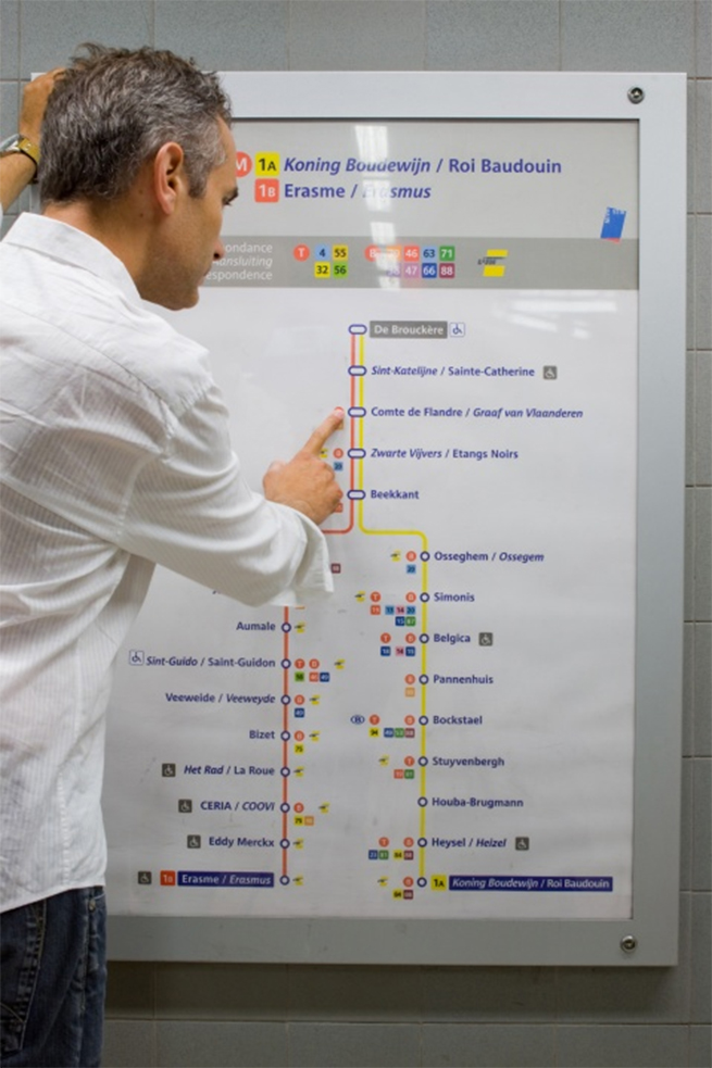
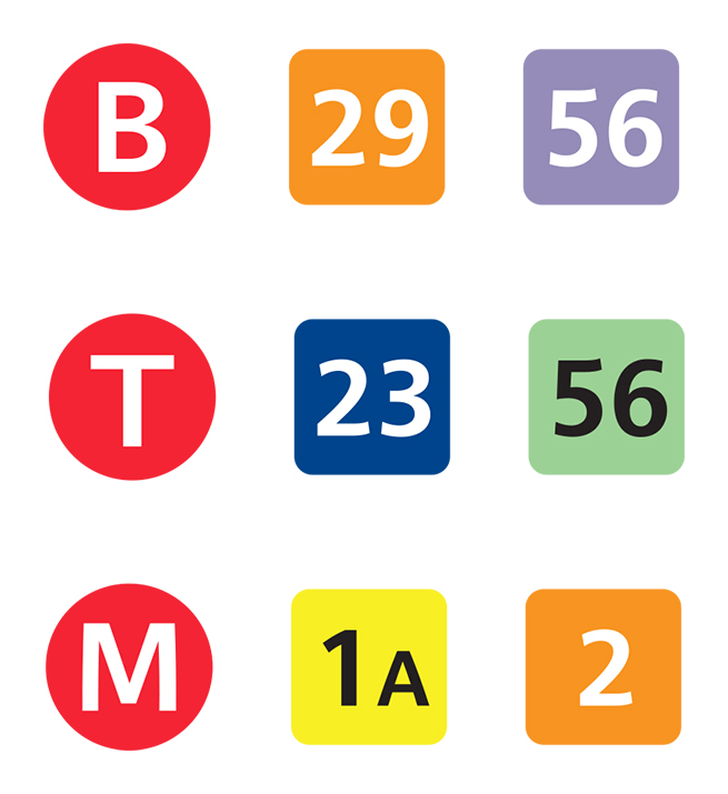
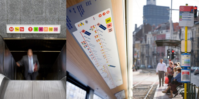
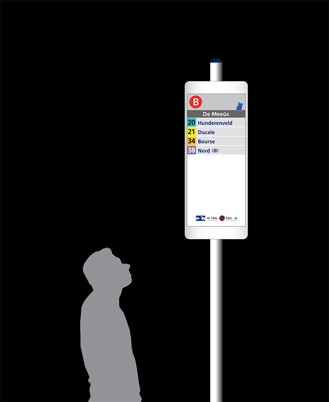
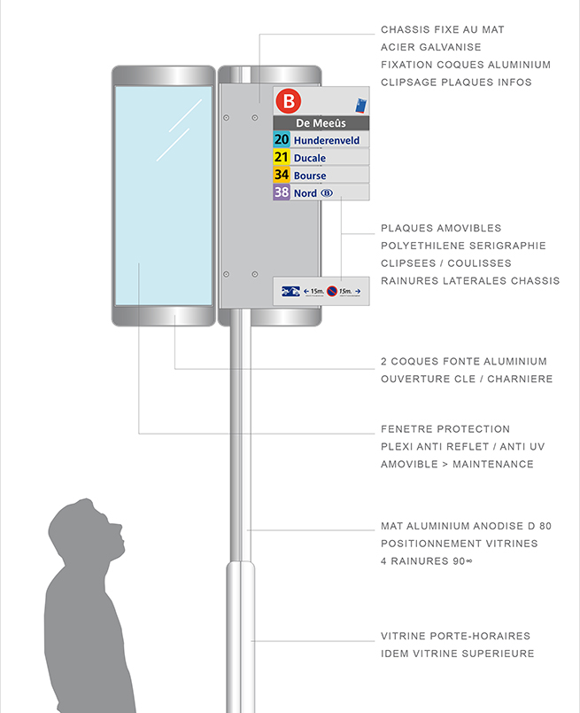
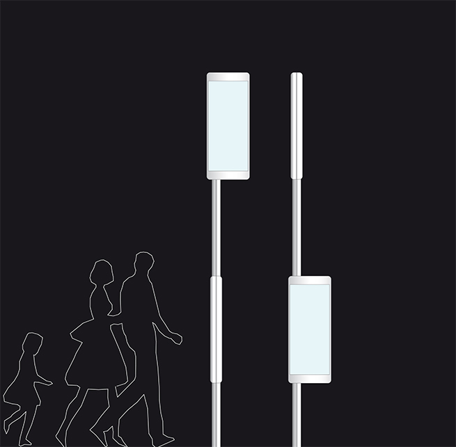
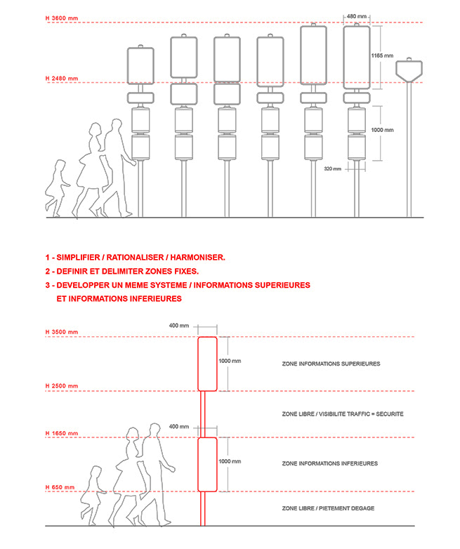
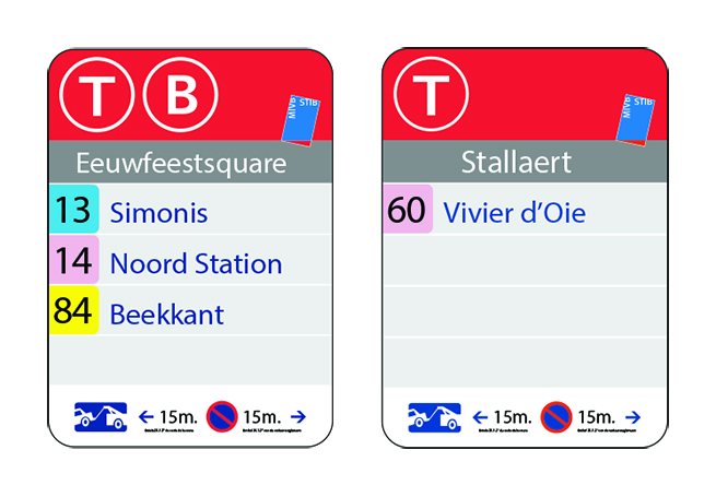
We began our mission with the signage and found that the different ways to identify the stations, lines and modes made the system highly incoherent, resulting in irregularities that would prejudice visibility. For a start, the multimodal transport possibilities were not perceived, mainly at the level of the subway interconnections. There were also too many information levels: directions, practical information, security, general information, etc. To create greater clarity, we redesigned the pictograms and the lines, and reorganised the information hierarchy either in the station or on stop panels.
Result
The products and services emerge from the standardization and are quickly recognised by the passengers. The sales network is a success wherever the points are. The flow is regulated and the tickets easily accessible.
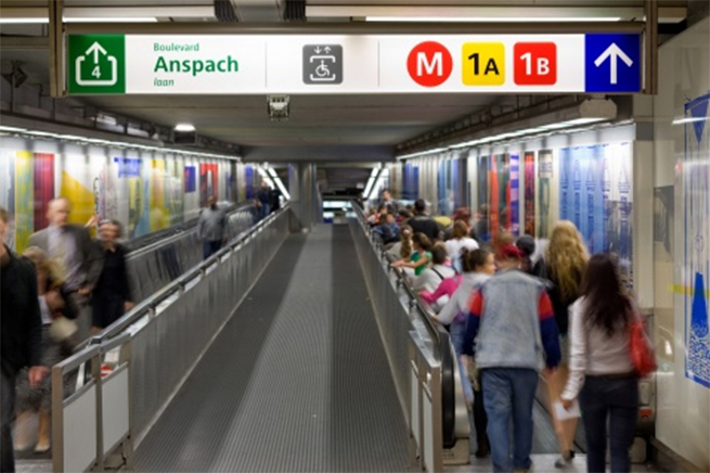
Finally, the new design system applied to signage and wayfinding makes travel much easier.
Management Team
Project and Creative Director: Jim Waters
Client Director: Gwenael Hanquet
Design team: Minale Design Strategy - Paris and Brussels offices